Mastering Color Theory
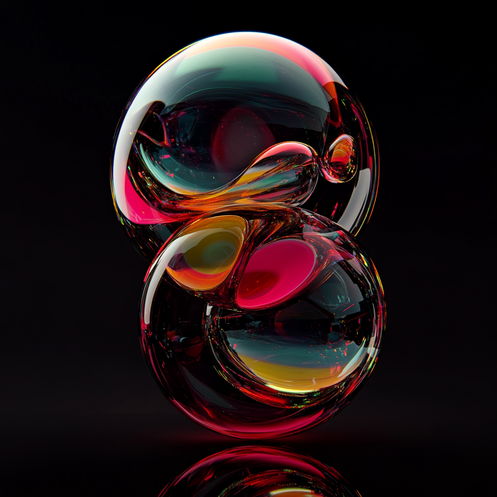
Color Harmonies
Try Interactive Color WheelComplementary

Colors opposite each other on the color wheel create maximum contrast and stability.
Analogous

Colors adjacent to each other on the color wheel create harmonious, comfortable designs.
Triadic
Three colors equally spaced around the color wheel create vibrant, balanced designs.
Emotional Impact
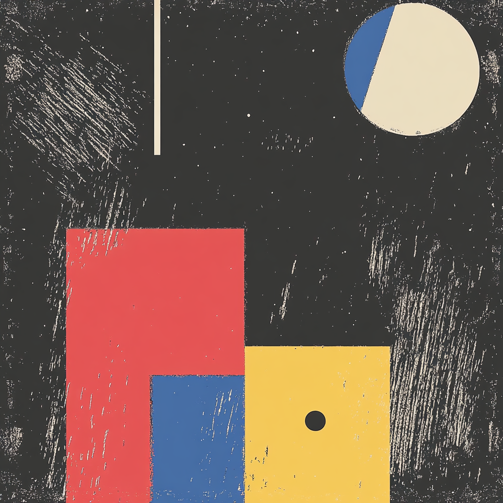
Warm Colors

Warm colors (reds, oranges, yellows) typically evoke:
- Energy and passion
- Warmth and comfort
- Excitement and optimism
Cool Colors

Cool colors (blues, greens, purples) typically evoke:
- Calmness and serenity
- Trust and stability
- Depth and mystery
Practical Applications
Color Grading
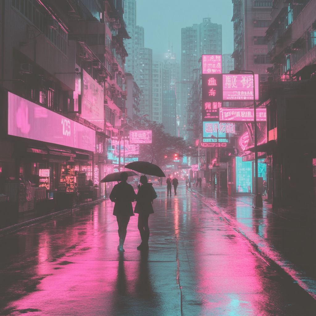
Use specific color palettes in your prompts to achieve desired moods and atmospheres.
Emotional Storytelling

Use color psychology to enhance the emotional impact of your scenes.
Style Consistency

Maintain consistent color palettes across a series of related artworks.
Ready to Practice?
Join our community and share your compositions with fellow AI artists.
Join art/acc